Archie's
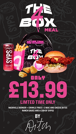
Archie’s - Aitch collaboration (The 4 box)
This page features a large-format billboard designed for the Aitch x Archie’s collab, placed right in the heart of Manchester. Built entirely in Illustrator, the graphic combines stacked typography, bold colour, and a photo of Aitch to anchor the visual with star power. It’s designed to be loud, local, and instantly iconic — a campaign moment that hits hard and feels rooted in the city.
Award-winning Aitch x Archie’s campaign, ‘Best Marketing Campaign’ at the 2026 QSR Awards


Below are some early iterations for the OOH designs

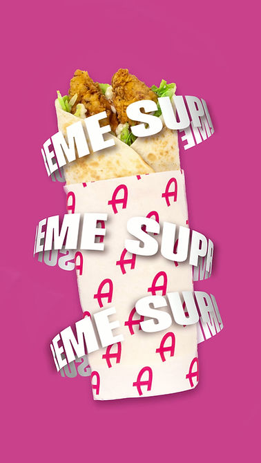
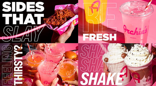
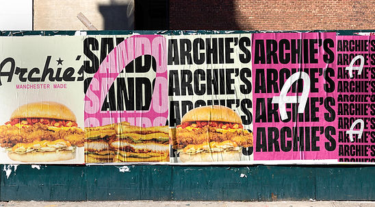
Below are key visuals from the Aitch x Archie collab, loud, layered, and unapologetically Manchester. I built these assets in Illustrator, leaning into bold type, interesting angles and product photography, and punchy colour to echo the energy of the campaign. It’s about hype, flavour, and making sure the message hits hard at first glance.

Final OOH billboard design in manchester


Final Digital POS

Large-Format LED Screen Design
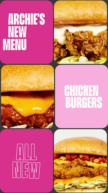
Archie’s rebrand and new menu launch
Maturing a cult-status brand requires a delicate balance of evolution and preservation. I architected this new visual landscape for Archie’s, ensuring the identity felt more sophisticated without losing its signature energy. This page documents the strategic application of our new colour and typography, leading into the vivid, in-store motion design that currently defines our product promotion..


The animations above were created using an Adobe After Effects Template. Working from a template, I integrated still images and applied motion graphics to give these digital display ads a dynamic, high-energy feel. For the creative on the right, I generated an AI image of jalapeños to serve as a vibrant flavour signifier.


This shows some of the dated collateral that Archie's were using.

These are some of the early digital screen designs that I crafted to let the food and drink, paired with simple type to visually pop.
These development mockups showcase the modern visual identity I’m currently spearheading at Archie’s. As one of the North West’s original smashed burger icons, the brand had drifted slightly from its culinary roots toward celebrity hype. My objective was to reclaim that food-first focus, balancing high-impact aesthetics with the unapologetic boldness that defines the Archie’s legacy.
Art directing the new look for Archie’s digital displays. The brief? Let the food do the talking, let simplicity win. I crafted these screens to ensure the vibrant new brand identity complements, rather than competes with, the photography. It’s all about finding that sweet spot between data-driven marketing strategy and clean, impactful design that grabs attention in a split second. Maximum flavour, zero visual clutter.

Some finalised digital screen design that came out of the rebrand.

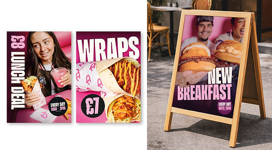
Updated a-board designs that hero food, lifestyle and type
Rebranding & Campaign Launch: Dip Stickers & AI-Driven Displays
The selection above showcases my recent work rebranding the dip stickers for our new menu launch. Alongside the packaging, I have highlighted the strategic journey behind creating commercial, AI-generated imagery for our promotional digital display screens. Using Adobe Firefly, I generated the foundational assets, which I then brought into Photoshop to composite, colour-grade, and enhance.
This process allowed me to rapidly iterate high-impact visuals while maintaining strict brand consistency and a premium aesthetic.

